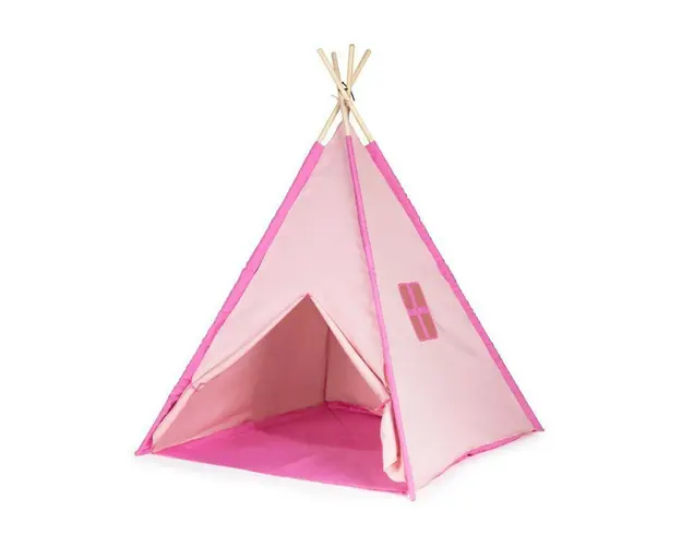
Cort tip indian pentru copii, Wigwam, 120 x 120 x 150 cm, Roz, EcoToys
192 lei
 Spre magazin »
Asigurăm doar prezentarea produselor, fără a ne implica în procesul de vânzare sau livrare si nu ne asumam nici o raspundere referitoare la imagini, preturi si comenzile efectuate.
.bd-grid { display: grid; display: grid; grid-template-columns: repeat(3, minmax(0, 1fr)); row-gap: 50px; column-gap: 50px; justify-items: center; text-align: center; } @media screen and (max-width: 600px) { .bd-grid { display: grid; grid-template-columns: repeat(1, minmax(0, 1fr)); } } .bd-grid-s { display: grid; display: grid; grid-template-columns: repeat(2, minmax(0, 1fr)); row-gap: 50px; column-gap: 50px; justify-items: center; text-align: center; align-items: center; } @media screen and (max-width: 600px) { .bd-grid-s { display: grid; grid-template-columns: repeat(1, minmax(0, 1fr)); } } Cort tip indian pentru copii, Wigwam cortul pentru copii estelocul ideal pentru joaca, atat in casa, cat si afara. Poate fi amplasat in camera copiiilor, pe balcon, terasa, sau in gradina; betele din care este construit cortul, sunt din lemn de pin.Betelese leaga in partea superioaraa cu o sfoara de fixare; constructia usoara si simplitatea cu care se asambleaza,permit mutarea acestuia in orice loc; uniti doua bete si introduceti-le in tunelurile din material. Apoi mai trebuie doar, salegati betele.Fereastra se afla pe peretele lateral. Distractie si imaginatie! Pentru ca nu exista copil care sa nu-si fi construit vreodata un cort sub a carei cupola sa fii luat nastere povesti fantastice asa cum numai imaginatia copiilor o pot crea, echipa noastra s-a gandit sa de-a o mana de ajutor copilasilor, punandu-va la dispozitie o colectie de corturi pentru copii in stil indian potrivite atat pentru fetite cat si pentru baietei. Asa numilele “teeppe tents” sunt usor de montat si depozitat (se strang in cateva secunde), stabile (daca sunt montate corespunzator) si au acea capacitate de a da starni imaginatia copiilor dand nastere la sute de povesti cu zane, zmei, bucatari, astronauti si cate si mai cate. Import de stiut ar fi insa ca un astfel de cort poate deveni foarte repede jucaria prferata a copilului d-voastra. Simplitate si confort! Creati-le copiiilor propriulsanctuarin casa.Cortul pentru copiiil puteti amenaja in camera de zi, sau in camera copiilor, insa, in timpul zilelor calde de vara, il puteti plasa si in gradina, sau pe terasa. Cortul pentru copii, este realizat dinmateriale de calitate.Asamblareaacestuiaeste foarte uaoar si simpla va va lua doar cateva minute. Asadar, creati-le copiiilor un spatiu confortabil, de care nu se vor satura asa de repede. SETUL CONTINE: cadrul (betele din lemn); cortul teepee de culoare roz; elementele de imbinare. DIMENSIUNI: Lungime: 120 cm; Latime: 120 cm; Inaltime: 150 cm. .bd-grid { display: grid; display: grid; grid-template-columns: repeat(3, minmax(0, 1fr)); row-gap: 50px; column-gap: 50px; justify-items: center; text-align: center; } @media screen and (max-width: 600px) { .bd-grid { display: grid; grid-template-columns: repeat(1, minmax(0, 1fr)); } } .bd-grid-s { display: grid; display: grid; grid-template-columns: repeat(2, minmax(0, 1fr)); row-gap: 50px; column-gap: 50px; justify-items: center; text-align: center; align-items: center; } @media screen and (max-width: 600px) { .bd-grid-s { display: grid; grid-template-columns: repeat(1, minmax(0, 1fr)); } } .bd-grid { display: grid; display: grid; grid-template-columns: repeat(3, minmax(0, 1fr)); row-gap: 50px; column-gap: 50px; justify-items: center; text-align: center; } @media screen and (max-width: 600px) { .bd-grid { display: grid; grid-template-columns: repeat(1, minmax(0, 1fr)); } } .bd-grid-s { display: grid; display: grid; grid-template-columns: repeat(2, minmax(0, 1fr)); row-gap: 50px; column-gap: 50px; justify-items: center; text-align: center; align-items: center; } @media screen and (max-width: 600px) { .bd-grid-s { display: grid; grid-template-columns: repeat(1, minmax(0, 1fr)); } } .bd-grid { display: grid; display: grid; grid-template-columns: repeat(3, minmax(0, 1fr)); row-gap: 50px; column-gap: 50px; justify-items: center; text-align: center; } @media screen and (max-width: 600px) { .bd-grid { display: grid; grid-template-columns: repeat(1, minmax(0, 1fr)); } } .bd-grid-s { display: grid; display: grid; grid-template-columns: repeat(2, minmax(0, 1fr)); row-gap: 50px; column-gap: 50px; justify-items: center; text-align: center; align-items: center; } @media screen and (max-width: 600px) { .bd-grid-s { display: grid; grid-template-columns: repeat(1, minmax(0, 1fr)); } } .bd-grid { display: grid; display: grid; grid-template-columns: repeat(3, minmax(0, 1fr)); row-gap: 50px; column-gap: 50px; justify-items: center; text-align: center; } @media screen and (max-width: 600px) { .bd-grid { display: grid; grid-template-columns: repeat(1, minmax(0, 1fr)); } } .bd-grid-s { display: grid; display: grid; grid-template-columns: repeat(2, minmax(0, 1fr)); row-gap: 50px; column-gap: 50px; justify-items: center; text-align: center; align-items: center; } @media screen and (max-width: 600px) { .bd-grid-s { display: grid; grid-template-columns: repeat(1, minmax(0, 1fr)); } } .bd-grid { display: grid; display: grid; grid-template-columns: repeat(3, minmax(0, 1fr)); row-gap: 50px; column-gap: 50px; justify-items: center; text-align: center; } @media screen and (max-width: 600px) { .bd-grid { display: grid; grid-template-columns: repeat(1, minmax(0, 1fr)); } } .bd-grid-s { display: grid; display: grid; grid-template-columns: repeat(2, minmax(0, 1fr)); row-gap: 50px; column-gap: 50px; justify-items: center; text-align: center; align-items: center; } @media screen and (max-width: 600px) { .bd-grid-s { display: grid; grid-template-columns: repeat(1, minmax(0, 1fr)); } } .bd-grid { display: grid; display: grid; grid-template-columns: repeat(3, minmax(0, 1fr)); row-gap: 50px; column-gap: 50px; justify-items: center; text-align: center; } @media screen and (max-width: 600px) { .bd-grid { display: grid; grid-template-columns: repeat(1, minmax(0, 1fr)); } } .bd-grid-s { display: grid; display: grid; grid-template-columns: repeat(2, minmax(0, 1fr)); row-gap: 50px; column-gap: 50px; justify-items: center; text-align: center; align-items: center; } @media screen and (max-width: 600px) { .bd-grid-s { display: grid; grid-template-columns: repeat(1, minmax(0, 1fr)); } } .bd-grid { display: grid; display: grid; grid-template-columns: repeat(3, minmax(0, 1fr)); row-gap: 50px; column-gap: 50px; justify-items: center; text-align: center; } @media screen and (max-width: 600px) { .bd-grid { display: grid; grid-template-columns: repeat(1, minmax(0, 1fr)); } } .bd-grid-s { display: grid; display: grid; grid-template-columns: repeat(2, minmax(0, 1fr)); row-gap: 50px; column-gap: 50px; justify-items: center; text-align: center; align-items: center; } @media screen and (max-width: 600px) { .bd-grid-s { display: grid; grid-template-columns: repeat(1, minmax(0, 1fr)); } } .bd-grid { display: grid; display: grid; grid-template-columns: repeat(3, minmax(0, 1fr)); row-gap: 50px; column-gap: 50px; justify-items: center; text-align: center; } @media screen and (max-width: 600px) { .bd-grid { display: grid; grid-template-columns: repeat(1, minmax(0, 1fr)); } } .bd-grid-s { display: grid; display: grid; grid-template-columns: repeat(2, minmax(0, 1fr)); row-gap: 50px; column-gap: 50px; justify-items: center; text-align: center; align-items: center; } @media screen and (max-width: 600px) { .bd-grid-s { display: grid; grid-template-columns: repeat(1, minmax(0, 1fr)); } } .bd-grid { display: grid; display: grid; grid-template-columns: repeat(3, minmax(0, 1fr)); row-gap: 50px; column-gap: 50px; justify-items: center; text-align: center; } @media screen and (max-width: 600px) { .bd-grid { display: grid; grid-template-columns: repeat(1, minmax(0, 1fr)); } } .bd-grid-s { display: grid; display: grid; grid-template-columns: repeat(2, minmax(0, 1fr)); row-gap: 50px; column-gap: 50px; justify-items: center; text-align: center; align-items: center; } @media screen and (max-width: 600px) { .bd-grid-s { display: grid; grid-template-columns: repeat(1, minmax(0, 1fr)); } } .bd-grid { display: grid; display: grid; grid-template-columns: repeat(3, minmax(0, 1fr)); row-gap: 50px; column-gap: 50px; justify-items: center; text-align: center; } @media screen and (max-width: 600px) { .bd-grid { display: grid; grid-template-columns: repeat(1, minmax(0, 1fr)); } } .bd-grid-s { display: grid; display: grid; grid-template-columns: repeat(2, minmax(0, 1fr)); row-gap: 50px; column-gap: 50px; justify-items: center; text-align: center; align-items: center; } @media screen and (max-width: 600px) { .bd-grid-s { display: grid; grid-template-columns: repeat(1, minmax(0, 1fr)); } } .bd-grid { display: grid; display: grid; grid-template-columns: repeat(3, minmax(0, 1fr)); row-gap: 50px; column-gap: 50px; justify-items: center; text-align: center; } @media screen and (max-width: 600px) { .bd-grid { display: grid; grid-template-columns: repeat(1, minmax(0, 1fr)); } } .bd-grid-s { display: grid; display: grid; grid-template-columns: repeat(2, minmax(0, 1fr)); row-gap: 50px; column-gap: 50px; justify-items: center; text-align: center; align-items: center; } @media screen and (max-width: 600px) { .bd-grid-s { display: grid; grid-template-columns: repeat(1, minmax(0, 1fr)); } } .bd-grid { display: grid; display: grid; grid-template-columns: repeat(3, minmax(0, 1fr)); row-gap: 50px; column-gap: 50px; justify-items: center; text-align: center; } @media screen and (max-width: 600px) { .bd-grid { display: grid; grid-template-columns: repeat(1, minmax(0, 1fr)); } } .bd-grid-s { display: grid; display: grid; grid-template-columns: repeat(2, minmax(0, 1fr)); row-gap: 50px; column-gap: 50px; justify-items: center; text-align: center; align-items: center; } @media screen and (max-width: 600px) { .bd-grid-s { display: grid; grid-template-columns: repeat(1, minmax(0, 1fr)); } } .bd-grid { display: grid; display: grid; grid-template-columns: repeat(3, minmax(0, 1fr)); row-gap: 50px; column-gap: 50px; justify-items: center; text-align: center; } @media screen and (max-width: 600px) { .bd-grid { display: grid; grid-template-columns: repeat(1, minmax(0, 1fr)); } } .bd-grid-s { display: grid; display: grid; grid-template-columns: repeat(2, minmax(0, 1fr)); row-gap: 50px; column-gap: 50px; justify-items: center; text-align: center; align-items: center; } @media screen and (max-width: 600px) { .bd-grid-s { display: grid; grid-template-columns: repeat(1, minmax(0, 1fr)); } } .bd-grid { display: grid; display: grid; grid-template-columns: repeat(3, minmax(0, 1fr)); row-gap: 50px; column-gap: 50px; justify-items: center; text-align: center; } @media screen and (max-width: 600px) { .bd-grid { display: grid; grid-template-columns: repeat(1, minmax(0, 1fr)); } } .bd-grid-s { display: grid; display: grid; grid-template-columns: repeat(2, minmax(0, 1fr)); row-gap: 50px; column-gap: 50px; justify-items: center; text-align: center; align-items: center; } @media screen and (max-width: 600px) { .bd-grid-s { display: grid; grid-template-columns: repeat(1, minmax(0, 1fr)); } } .bd-grid { display: grid; display: grid; grid-template-columns: repeat(3, minmax(0, 1fr)); row-gap: 50px; column-gap: 50px; justify-items: center; text-align: center; } @media screen and (max-width: 600px) { .bd-grid { display: grid; grid-template-columns: repeat(1, minmax(0, 1fr)); } } .bd-grid-s { display: grid; display: grid; grid-template-columns: repeat(2, minmax(0, 1fr)); row-gap: 50px; column-gap: 50px; justify-items: center; text-align: center; align-items: center; } @media screen and (max-width: 600px) { .bd-grid-s { display: grid; grid-template-columns: repeat(1, minmax(0, 1fr)); } } .bd-grid { display: grid; display: grid; grid-template-columns: repeat(3, minmax(0, 1fr)); row-gap: 50px; column-gap: 50px; justify-items: center; text-align: center; } @media screen and (max-width: 600px) { .bd-grid { display: grid; grid-template-columns: repeat(1, minmax(0, 1fr)); } } .bd-grid-s { display: grid; display: grid; grid-template-columns: repeat(2, minmax(0, 1fr)); row-gap: 50px; column-gap: 50px; justify-items: center; text-align: center; align-items: center; } @media screen and (max-width: 600px) { .bd-grid-s { display: grid; grid-template-columns: repeat(1, minmax(0, 1fr)); } } .bd-grid { display: grid; display: grid; grid-template-columns: repeat(3, minmax(0, 1fr)); row-gap: 50px; column-gap: 50px; justify-items: center; text-align: center; } @media screen and (max-width: 600px) { .bd-grid { display: grid; grid-template-columns: repeat(1, minmax(0, 1fr)); } } .bd-grid-s { display: grid; display: grid; grid-template-columns: repeat(2, minmax(0, 1fr)); row-gap: 50px; column-gap: 50px; justify-items: center; text-align: center; align-items: center; } @media screen and (max-width: 600px) { .bd-grid-s { display: grid; grid-template-columns: repeat(1, minmax(0, 1fr)); } } .bd-grid { display: grid; display: grid; grid-template-columns: repeat(3, minmax(0, 1fr)); row-gap: 50px; column-gap: 50px; justify-items: center; text-align: center; } @media screen and (max-width: 600px) { .bd-grid { display: grid; grid-template-columns: repeat(1, minmax(0, 1fr)); } } .bd-grid-s { display: grid; display: grid; grid-template-columns: repeat(2, minmax(0, 1fr)); row-gap: 50px; column-gap: 50px; justify-items: center; text-align: center; align-items: center; } @media screen and (max-width: 600px) { .bd-grid-s { display: grid; grid-template-columns: repeat(1, minmax(0, 1fr)); } } .bd-grid { display: grid; display: grid; grid-template-columns: repeat(3, minmax(0, 1fr)); row-gap: 50px; column-gap: 50px; justify-items: center; text-align: center; } @media screen and (max-width: 600px) { .bd-grid { display: grid; grid-template-columns: repeat(1, minmax(0, 1fr)); } } .bd-grid-s { display: grid; display: grid; grid-template-columns: repeat(2, minmax(0, 1fr)); row-gap: 50px; column-gap: 50px; justify-items: center; text-align: center; align-items: center; } @media screen and (max-width: 600px) { .bd-grid-s { display: grid; grid-template-columns: repeat(1, minmax(0, 1fr)); } } .bd-grid { display: grid; display: grid; grid-template-columns: repeat(3, minmax(0, 1fr)); row-gap: 50px; column-gap: 50px; justify-items: center; text-align: center; } @media screen and (max-width: 600px) { .bd-grid { display: grid; grid-template-columns: repeat(1, minmax(0, 1fr)); } } .bd-grid-s { display: grid; display: grid; grid-template-columns: repeat(2, minmax(0, 1fr)); row-gap: 50px; column-gap: 50px; justify-items: center; text-align: center; align-items: center; } @media screen and (max-width: 600px) { .bd-grid-s { display: grid; grid-template-columns: repeat(1, minmax(0, 1fr)); } } .bd-grid { display: grid; display: grid; grid-template-columns: repeat(3, minmax(0, 1fr)); row-gap: 50px; column-gap: 50px; justify-items: center; text-align: center; } @media screen and (max-width: 600px) { .bd-grid { display: grid; grid-template-columns: repeat(1, minmax(0, 1fr)); } } .bd-grid-s { display: grid; display: grid; grid-template-columns: repeat(2, minmax(0, 1fr)); row-gap: 50px; column-gap: 50px; justify-items: center; text-align: center; align-items: center; } @media screen and (max-width: 600px) { .bd-grid-s { display: grid; grid-template-columns: repeat(1, minmax(0, 1fr)); } } .bd-grid { display: grid; display: grid; grid-template-columns: repeat(3, minmax(0, 1fr)); row-gap: 50px; column-gap: 50px; justify-items: center; text-align: center; } @media screen and (max-width: 600px) { .bd-grid { display: grid; grid-template-columns: repeat(1, minmax(0, 1fr)); } } .bd-grid-s { display: grid; display: grid; grid-template-columns: repeat(2, minmax(0, 1fr)); row-gap: 50px; column-gap: 50px; justify-items: center; text-align: center; align-items: center; } @media screen and (max-width: 600px) { .bd-grid-s { display: grid; grid-template-columns: repeat(1, minmax(0, 1fr)); } } .bd-grid { display: grid; display: grid; grid-template-columns: repeat(3, minmax(0, 1fr)); row-gap: 50px; column-gap: 50px; justify-items: center; text-align: center; } @media screen and (max-width: 600px) { .bd-grid { display: grid; grid-template-columns: repeat(1, minmax(0, 1fr)); } } .bd-grid-s { display: grid; display: grid; grid-template-columns: repeat(2, minmax(0, 1fr)); row-gap: 50px; column-gap: 50px; justify-items: center; text-align: center; align-items: center; } @media screen and (max-width: 600px) { .bd-grid-s { display: grid; grid-template-columns: repeat(1, minmax(0, 1fr)); } } .bd-grid { display: grid; display: grid; grid-template-columns: repeat(3, minmax(0, 1fr)); row-gap: 50px; column-gap: 50px; justify-items: center; text-align: center; } @media screen and (max-width: 600px) { .bd-grid { display: grid; grid-template-columns: repeat(1, minmax(0, 1fr)); } } .bd-grid-s { display: grid; display: grid; grid-template-columns: repeat(2, minmax(0, 1fr)); row-gap: 50px; column-gap: 50px; justify-items: center; text-align: center; align-items: center; } @media screen and (max-width: 600px) { .bd-grid-s { display: grid; grid-template-columns: repeat(1, minmax(0, 1fr)); } } .bd-grid { display: grid; display: grid; grid-template-columns: repeat(3, minmax(0, 1fr)); row-gap: 50px; column-gap: 50px; justify-items: center; text-align: center; } @media screen and (max-width: 600px) { .bd-grid { display: grid; grid-template-columns: repeat(1, minmax(0, 1fr)); } } .bd-grid-s { display: grid; display: grid; grid-template-columns: repeat(2, minmax(0, 1fr)); row-gap: 50px; column-gap: 50px; justify-items: center; text-align: center; align-items: center; } @media screen and (max-width: 600px) { .bd-grid-s { display: grid; grid-template-columns: repeat(1, minmax(0, 1fr)); } } .bd-grid { display: grid; display: grid; grid-template-columns: repeat(3, minmax(0, 1fr)); row-gap: 50px; column-gap: 50px; justify-items: center; text-align: center; } @media screen and (max-width: 600px) { .bd-grid { display: grid; grid-template-columns: repeat(1, minmax(0, 1fr)); } } .bd-grid-s { display: grid; display: grid; grid-template-columns: repeat(2, minmax(0, 1fr)); row-gap: 50px; column-gap: 50px; justify-items: center; text-align: center; align-items: center; } @media screen and (max-width: 600px) { .bd-grid-s { display: grid; grid-template-columns: repeat(1, minmax(0, 1fr)); } } .bd-grid { display: grid; display: grid; grid-template-columns: repeat(3, minmax(0, 1fr)); row-gap: 50px; column-gap: 50px; justify-items: center; text-align: center; } @media screen and (max-width: 600px) { .bd-grid { display: grid; grid-template-columns: repeat(1, minmax(0, 1fr)); } } .bd-grid-s { display: grid; display: grid; grid-template-columns: repeat(2, minmax(0, 1fr)); row-gap: 50px; column-gap: 50px; justify-items: center; text-align: center; align-items: center; } @media screen and (max-width: 600px) { .bd-grid-s { display: grid; grid-template-columns: repeat(1, minmax(0, 1fr)); } } .bd-grid { display: grid; display: grid; grid-template-columns: repeat(3, minmax(0, 1fr)); row-gap: 50px; column-gap: 50px; justify-items: center; text-align: center; } @media screen and (max-width: 600px) { .bd-grid { display: grid; grid-template-columns: repeat(1, minmax(0, 1fr)); } } .bd-grid-s { display: grid; display: grid; grid-template-columns: repeat(2, minmax(0, 1fr)); row-gap: 50px; column-gap: 50px; justify-items: center; text-align: center; align-items: center; } @media screen and (max-width: 600px) { .bd-grid-s { display: grid; grid-template-columns: repeat(1, minmax(0, 1fr)); } } .bd-grid { display: grid; display: grid; grid-template-columns: repeat(3, minmax(0, 1fr)); row-gap: 50px; column-gap: 50px; justify-items: center; text-align: center; } @media screen and (max-width: 600px) { .bd-grid { display: grid; grid-template-columns: repeat(1, minmax(0, 1fr)); } } .bd-grid-s { display: grid; display: grid; grid-template-columns: repeat(2, minmax(0, 1fr)); row-gap: 50px; column-gap: 50px; justify-items: center; text-align: center; align-items: center; } @media screen and (max-width: 600px) { .bd-grid-s { display: grid; grid-template-columns: repeat(1, minmax(0, 1fr)); } } .bd-grid { display: grid; display: grid; grid-template-columns: repeat(3, minmax(0, 1fr)); row-gap: 50px; column-gap: 50px; justify-items: center; text-align: center; } @media screen and (max-width: 600px) { .bd-grid { display: grid; grid-template-columns: repeat(1, minmax(0, 1fr)); } } .bd-grid-s { display: grid; display: grid; grid-template-columns: repeat(2, minmax(0, 1fr)); row-gap: 50px; column-gap: 50px; justify-items: center; text-align: center; align-items: center; } @media screen and (max-width: 600px) { .bd-grid-s { display: grid; grid-template-columns: repeat(1, minmax(0, 1fr)); } } .bd-grid { display: grid; display: grid; grid-template-columns: repeat(3, minmax(0, 1fr)); row-gap: 50px; column-gap: 50px; justify-items: center; text-align: center; } @media screen and (max-width: 600px) { .bd-grid { display: grid; grid-template-columns: repeat(1, minmax(0, 1fr)); } } .bd-grid-s { display: grid; display: grid; grid-template-columns: repeat(2, minmax(0, 1fr)); row-gap: 50px; column-gap: 50px; justify-items: center; text-align: center; align-items: center; } @media screen and (max-width: 600px) { .bd-grid-s { display: grid; grid-template-columns: repeat(1, minmax(0, 1fr)); } } .bd-grid { display: grid; display: grid; grid-template-columns: repeat(3, minmax(0, 1fr)); row-gap: 50px; column-gap: 50px; justify-items: center; text-align: center; } @media screen and (max-width: 600px) { .bd-grid { display: grid; grid-template-columns: repeat(1, minmax(0, 1fr)); } } .bd-grid-s { display: grid; display: grid; grid-template-columns: repeat(2, minmax(0, 1fr)); row-gap: 50px; column-gap: 50px; justify-items: center; text-align: center; align-items: center; } @media screen and (max-width: 600px) { .bd-grid-s { display: grid; grid-template-columns: repeat(1, minmax(0, 1fr)); } } .bd-grid { display: grid; display: grid; grid-template-columns: repeat(3, minmax(0, 1fr)); row-gap: 50px; column-gap: 50px; justify-items: center; text-align: center; } @media screen and (max-width: 600px) { .bd-grid { display: grid; grid-template-columns: repeat(1, minmax(0, 1fr)); } } .bd-grid-s { display: grid; display: grid; grid-template-columns: repeat(2, minmax(0, 1fr)); row-gap: 50px; column-gap: 50px; justify-items: center; text-align: center; align-items: center; } @media screen and (max-width: 600px) { .bd-grid-s { display: grid; grid-template-columns: repeat(1, minmax(0, 1fr)); } } .bd-grid { display: grid; display: grid; grid-template-columns: repeat(3, minmax(0, 1fr)); row-gap: 50px; column-gap: 50px; justify-items: center; text-align: center; } @media screen and (max-width: 600px) { .bd-grid { display: grid; grid-template-columns: repeat(1, minmax(0, 1fr)); } } .bd-grid-s { display: grid; display: grid; grid-template-columns: repeat(2, minmax(0, 1fr)); row-gap: 50px; column-gap: 50px; justify-items: center; text-align: center; align-items: center; } @media screen and (max-width: 600px) { .bd-grid-s { display: grid; grid-template-columns: repeat(1, minmax(0, 1fr)); } } .bd-grid { display: grid; display: grid; grid-template-columns: repeat(3, minmax(0, 1fr)); row-gap: 50px; column-gap: 50px; justify-items: center; text-align: center; } @media screen and (max-width: 600px) { .bd-grid { display: grid; grid-template-columns: repeat(1, minmax(0, 1fr)); } } .bd-grid-s { display: grid; display: grid; grid-template-columns: repeat(2, minmax(0, 1fr)); row-gap: 50px; column-gap: 50px; justify-items: center; text-align: center; align-items: center; } @media screen and (max-width: 600px) { .bd-grid-s { display: grid; grid-template-columns: repeat(1, minmax(0, 1fr)); } } .bd-grid { display: grid; display: grid; grid-template-columns: repeat(3, minmax(0, 1fr)); row-gap: 50px; column-gap: 50px; justify-items: center; text-align: center; } @media screen and (max-width: 600px) { .bd-grid { display: grid; grid-template-columns: repeat(1, minmax(0, 1fr)); } } .bd-grid-s { display: grid; display: grid; grid-template-columns: repeat(2, minmax(0, 1fr)); row-gap: 50px; column-gap: 50px; justify-items: center; text-align: center; align-items: center; } @media screen and (max-width: 600px) { .bd-grid-s { display: grid; grid-template-columns: repeat(1, minmax(0, 1fr)); } } .bd-grid { display: grid; display: grid; grid-template-columns: repeat(3, minmax(0, 1fr)); row-gap: 50px; column-gap: 50px; justify-items: center; text-align: center; } @media screen and (max-width: 600px) { .bd-grid { display: grid; grid-template-columns: repeat(1, minmax(0, 1fr)); } } .bd-grid-s { display: grid; display: grid; grid-template-columns: repeat(2, minmax(0, 1fr)); row-gap: 50px; column-gap: 50px; justify-items: center; text-align: center; align-items: center; } @media screen and (max-width: 600px) { .bd-grid-s { display: grid; grid-template-columns: repeat(1, minmax(0, 1fr)); } } .bd-grid { display: grid; display: grid; grid-template-columns: repeat(3, minmax(0, 1fr)); row-gap: 50px; column-gap: 50px; justify-items: center; text-align: center; } @media screen and (max-width: 600px) { .bd-grid { display: grid; grid-template-columns: repeat(1, minmax(0, 1fr)); } } .bd-grid-s { display: grid; display: grid; grid-template-columns: repeat(2, minmax(0, 1fr)); row-gap: 50px; column-gap: 50px; justify-items: center; text-align: center; align-items: center; } @media screen and (max-width: 600px) { .bd-grid-s { display: grid; grid-template-columns: repeat(1, minmax(0, 1fr)); } } .bd-grid { display: grid; display: grid; grid-template-columns: repeat(3, minmax(0, 1fr)); row-gap: 50px; column-gap: 50px; justify-items: center; text-align: center; } @media screen and (max-width: 600px) { .bd-grid { display: grid; grid-template-columns: repeat(1, minmax(0, 1fr)); } } .bd-grid-s { display: grid; display: grid; grid-template-columns: repeat(2, minmax(0, 1fr)); row-gap: 50px; column-gap: 50px; justify-items: center; text-align: center; align-items: center; } @media screen and (max-width: 600px) { .bd-grid-s { display: grid; grid-template-columns: repeat(1, minmax(0, 1fr)); } } .bd-grid { display: grid; display: grid; grid-template-columns: repeat(3, minmax(0, 1fr)); row-gap: 50px; column-gap: 50px; justify-items: center; text-align: center; } @media screen and (max-width: 600px) { .bd-grid { display: grid; grid-template-columns: repeat(1, minmax(0, 1fr)); } } .bd-grid-s { display: grid; display: grid; grid-template-columns: repeat(2, minmax(0, 1fr)); row-gap: 50px; column-gap: 50px; justify-items: center; text-align: center; align-items: center; } @media screen and (max-width: 600px) { .bd-grid-s { display: grid; grid-template-columns: repeat(1, minmax(0, 1fr)); } } .bd-grid { display: grid; display: grid; grid-template-columns: repeat(3, minmax(0, 1fr)); row-gap: 50px; column-gap: 50px; justify-items: center; text-align: center; } @media screen and (max-width: 600px) { .bd-grid { display: grid; grid-template-columns: repeat(1, minmax(0, 1fr)); } } .bd-grid-s { display: grid; display: grid; grid-template-columns: repeat(2, minmax(0, 1fr)); row-gap: 50px; column-gap: 50px; justify-items: center; text-align: center; align-items: center; } @media screen and (max-width: 600px) { .bd-grid-s { display: grid; grid-template-columns: repeat(1, minmax(0, 1fr)); } } .bd-grid { display: grid; display: grid; grid-template-columns: repeat(3, minmax(0, 1fr)); row-gap: 50px; column-gap: 50px; justify-items: center; text-align: center; } @media screen and (max-width: 600px) { .bd-grid { display: grid; grid-template-columns: repeat(1, minmax(0, 1fr)); } } .bd-grid-s { display: grid; display: grid; grid-template-columns: repeat(2, minmax(0, 1fr)); row-gap: 50px; column-gap: 50px; justify-items: center; text-align: center; align-items: center; } @media screen and (max-width: 600px) { .bd-grid-s { display: grid; grid-template-columns: repeat(1, minmax(0, 1fr)); } } .bd-grid { display: grid; display: grid; grid-template-columns: repeat(3, minmax(0, 1fr)); row-gap: 50px; column-gap: 50px; justify-items: center; text-align: center; } @media screen and (max-width: 600px) { .bd-grid { display: grid; grid-template-columns: repeat(1, minmax(0, 1fr)); } } .bd-grid-s { display: grid; display: grid; grid-template-columns: repeat(2, minmax(0, 1fr)); row-gap: 50px; column-gap: 50px; justify-items: center; text-align: center; align-items: center; } @media screen and (max-width: 600px) { .bd-grid-s { display: grid; grid-template-columns: repeat(1, minmax(0, 1fr)); } } Produsul cu denumirea Cort tip indian pentru copii, Wigwam, 120 x 120 x 150 cm, Roz, EcoToys face parte din brandul Mochtoys, se afla in categoria Costume carnaval copii si subcategoria
Brand: Mochtoys
Categorie: Costume carnaval copii
Produsul Cort tip indian pentru copii, Wigwam, 120 x 120 x 150 cm, Roz, EcoToys este vandut de catre magazinul babyneeds.ro
